Introduction to Typography in Vehicle Wrap Advertising
Typography is often the unsung hero of effective car wraps. While stunning imagery and finishes catch the eye, it’s the words—and how they are presented—that deliver the message. On moving canvases like vehicles, legibility, placement, and style all come into play. If done well, typography can transform an ordinary wrap into a mobile billboard that speaks volumes. In this guide, you’ll discover how to make your fonts truly speak.
Why Typography Matters in Car Wrap Design
The Power of Text on Moving Media
Cars, trucks, and vans move through traffic at varying speeds and in diverse environments. While flashy graphics grab attention, clear and purposeful typography ensures your audience receives the message—whether it’s brand awareness, a call to action, or contact information.
Balancing Imagery and Fonts
A strong car wrap balances text and visuals. Overcrowding with graphics diminishes the power of typography, while a clean design can amplify your message and drive brand recognition.
Choosing the Right Font for Your Car Wrap
Matching Font to Brand Identity
Your font choice should echo your brand’s personality. A sleek sans-serif conveys modernity, a bold slab serif implies strength, while a playful handwritten type suggests fun. Let your typeface mirror your brand voice.
Choosing Bold and Legible Fonts
Bold, clean lines enhance visibility, especially when your vehicle is moving. Go for fonts that maintain clarity from a distance, ensuring that your key messages are noticed in a split second.
Key Considerations When Selecting Typography
Message Tone and Brand Voice
Consider whether you want your message to feel professional, playful, luxurious, or rugged. The right typography sets the tone before the viewer even reads the words.
Audience Demographics
Think about who you’re targeting—young urbanites? Corporate clients? Families? The font must appeal to your audience while reinforcing the intended message.
Advertising Goals
Whether the goal is brand recognition, lead generation, or event promotion, typography should support the campaign’s primary objectives.
Understanding Font Readability for Mobile Displays
Readability at Different Speeds
Typography needs to perform when the vehicle is parked, crawling in traffic, or speeding down the highway. Test your font choice for legibility at various distances and speeds.
Viewing Angles and Distance
Since passersby may view your vehicle from the side, behind, or an elevated angle, ensure your typography is large enough and positioned optimally for all perspectives.
Font Size and Placement Guidelines
Optimal Text Size for Visibility
For primary messages (business name, slogan), aim for 4”–6” tall letters on the sides of large vehicles, and slightly smaller for compact cars. Subtext like contact details should be at least 2” tall for clear reading.
Best Positions on Various Vehicle Types
- Sides: Ideal for bold headlines
- Rear doors/panels: Great for calls to action (perfect during stop-and-go traffic)
- Hood: Often avoided, but sometimes works for event-based wraps or specific branding
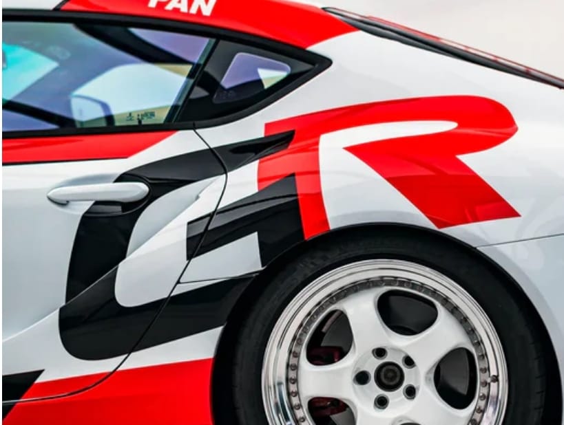
The Role of Contrast and Color in Effective Typography
High Contrast for Maximum Impact
High contrast improves visibility. Examples include:
- White text on black wraps
- Black text on white vans
- Bright colors (yellow, red) against dark backgrounds
Avoiding Common Color Pitfalls
Avoid placing light text on busy or colorful patterns. Steer clear of low-contrast combinations like light gray on silver.
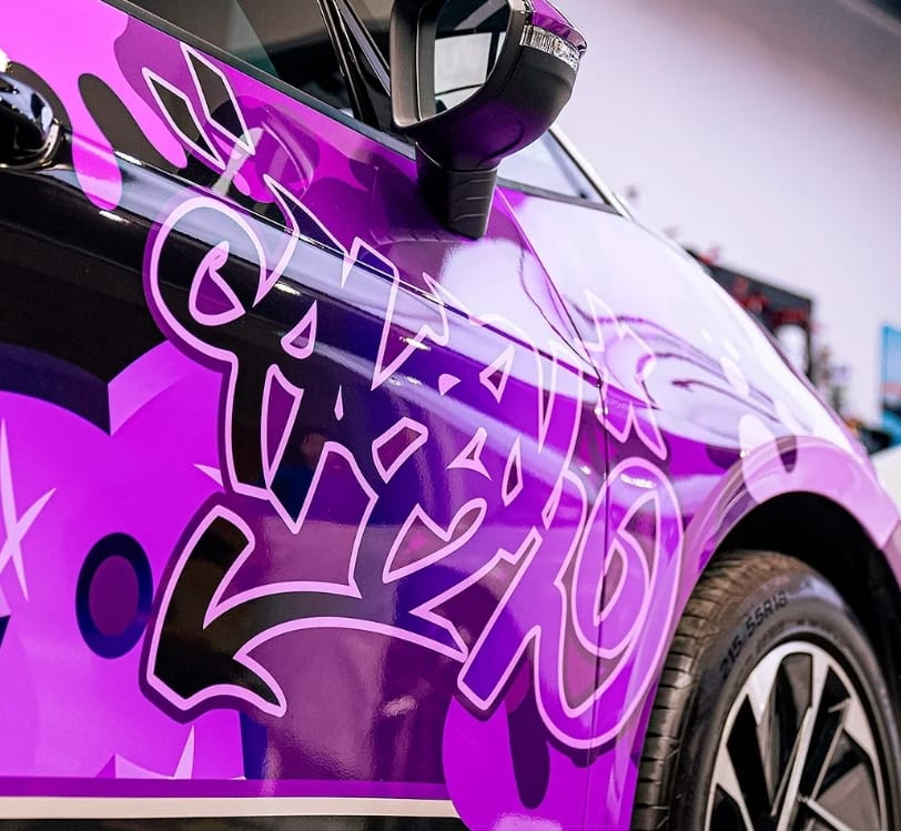
Combining Fonts: How to Use Font Pairings Successfully
Complementary Font Pairing Tips
Pair a strong headline font with a simple body type. For example:
- Bold sans-serif for brand names
- Clean serif for taglines
How Many Fonts to Use Effectively
Stick to one or two fonts max. Using too many fonts creates visual clutter and dilutes brand impact.
Organizing Text for Impact and Clarity
Visual Hierarchy of Information
Prioritize the most important details:
- Business Name
- Slogan/Tagline
- Contact Info (phone, website)
Structuring Key Messages
Use size, weight, and color to direct the viewer’s eye. Ensure easy scanning, even in traffic.
Dealing with Vehicle Curves, Panels, and Design Challenges
Adapting Typography to Contours
Be mindful of curves, door handles, seams, and wheel arches. Text should flow naturally with the vehicle’s structure.
Avoiding Distortion in Critical Areas
Never stretch fonts to fit awkward spaces. Adjust your layout or size to maintain clarity.
Maintaining Brand Consistency Through Typography
Carrying Typography Across Marketing Channels
Use the same fonts on car wraps as on your website, business cards, and social media. This builds a cohesive brand image.
Reinforcing Brand Identity on the Move
A moving vehicle with consistent, well-designed typography can reinforce brand recognition across your target market.
Common Mistakes to Avoid When Designing Typography for Car Wraps
- Using fonts that are too thin or ornate
- Placing text over busy images
- Using low-contrast combinations
- Overcrowding the design with too much text
- Ignoring the vehicle’s curves and panels
The Importance of Using High-Quality Print Media
Why Material Quality Affects Typography
Poor-quality vinyl can distort or fade typography. Always choose premium-grade digital print media.
Recommended Suppliers like Carlas
Brands like Carlas offer worldwide shipping of high-grade vinyl wraps perfect for showcasing typography that lasts.
Conclusion: Let Your Fonts Do the Talking
Typography on car wraps is more than a design choice—it’s a tool for communication. With thoughtful font selection, strategic placement, and high-quality materials, your message can resonate with audiences across every street. Ready to elevate your brand? Visit Carlas for premium vinyl solutions and let your fonts do the talking!